Time to Vaccinate
Posted onThis post is completely inspired by @mjskay ’s very interesting analysis/ critique of a New York Times linear extrapolation of when the United States would reach the critical proportion for vaccination. The New York Times has made some amazing graphics during the pandemic, but their analyses have been pretty spotty. Between this linear extrapolation of vaccination rates and their SIRs for third and fourth waves, they really need to put some additional thought into the more math heavy type work.
I try to avoid the whole “herd immunity” lingo. In Anderson and May, the refer to the “critical proportion” at which herd immunity protection effects kick in. I like this formulation a bit better.
Matt uses Bayesian Structural Time Series implemented in the bsts
package(which I really like) in order to make a more nuanced analysis.
Additionally, because we know that the percent vaccinated is
monotonically increasing and bounded between 0 and 1, we can make some
transforms to our data.
North Carolina
I along with some work colleauges have been maintaining a package called
nccovid (available at
remotes::install_github("conedatascience/nccovid)) which allows for
ready access to North Carolina COVID-19 related data. This does not
represent the views of my employer.
Data Prep
First I am going to pull in the needed packages:
And now we can pull in the North Carolina data:
dat <- nccovid::
nc_oa <- dat %>%
. %>%
.
It’s good to plot these data just to make sure they “feel” right.
nc_oa %>%
+
+
+
+
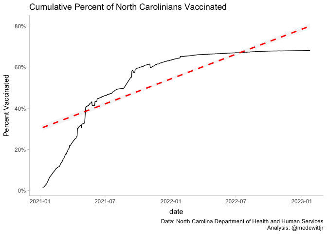
So we can see that linear fit for North Carolina likely isn’t valid, at least not in the last few weeks. Regardless, we have out data for the next steps of the analysis.
Data Transformation
As I mentioned earlier and a critical point of this analysis is that we know a few things about vaccinations. Firstly, vaccinations are non-reversible and are thus monotonically increasing (e.g., they can only increase). Additionally, depending on the definition you take, the percentage of the population vaccinated with a first dose is bound between 0 and 1.
It’s a bit of a joke. I suppose someone could have multiple first doses if you change the definition to the manufacturer of the vaccine.
With these features in mind, we can use a logit transform on our vaccinations and then fit that on our data.
nc_log_diff <- nc_oa %>%
%>%
%>%
%>%
dplyr:: %>%
%>%
%>%
Now we can fit the model using the priors that Matt used.
fit =
=-=-=-=-= Iteration 0 Sat Jan 13 15:59:50 2024 =-=-=-=-=
=-=-=-=-= Iteration 4000 Sat Jan 13 16:00:10 2024 =-=-=-=-=
=-=-=-=-= Iteration 8000 Sat Jan 13 16:00:30 2024 =-=-=-=-=
=-=-=-=-= Iteration 12000 Sat Jan 13 16:00:50 2024 =-=-=-=-=
=-=-=-=-= Iteration 16000 Sat Jan 13 16:01:10 2024 =-=-=-=-=
=-=-=-=-= Iteration 20000 Sat Jan 13 16:01:30 2024 =-=-=-=-=
=-=-=-=-= Iteration 24000 Sat Jan 13 16:01:49 2024 =-=-=-=-=
=-=-=-=-= Iteration 28000 Sat Jan 13 16:02:09 2024 =-=-=-=-=
=-=-=-=-= Iteration 32000 Sat Jan 13 16:02:30 2024 =-=-=-=-=
=-=-=-=-= Iteration 36000 Sat Jan 13 16:02:50 2024 =-=-=-=-=
Diagnostics (that I did not know could be leveraged from posterior. just a really great package).
draws <-
%>%
knitr::
| variable | median | mad | q5 | q95 | rhat | ess_bulk | ess_tail |
|---|---|---|---|---|---|---|---|
| sigma.obs | 0.626 | 0.042 | 0.556 | 0.695 | 1.001 | 2999.678 | 5324.536 |
| trend.level.sd | 0.198 | 0.036 | 0.144 | 0.265 | 1.000 | 1020.569 | 2105.828 |
| trend.slope.mean | -0.021 | 0.016 | -0.049 | 0.005 | 1.000 | 11344.044 | 17738.522 |
| trend.slope.ar.coefficient | -0.548 | 0.169 | -0.771 | -0.193 | 1.004 | 1292.182 | 1909.998 |
| trend.slope.sd | 0.293 | 0.055 | 0.213 | 0.397 | 1.001 | 844.252 | 1781.284 |
| sigma.seasonal.7 | 0.134 | 0.020 | 0.106 | 0.174 | 1.001 | 1548.782 | 2872.391 |
All of the Gelman-Rubin statistics look good as well as the effective sample sizes, so I’m happy with what I see. However, it is always good to visualize the outputs as well:
bayesplot::
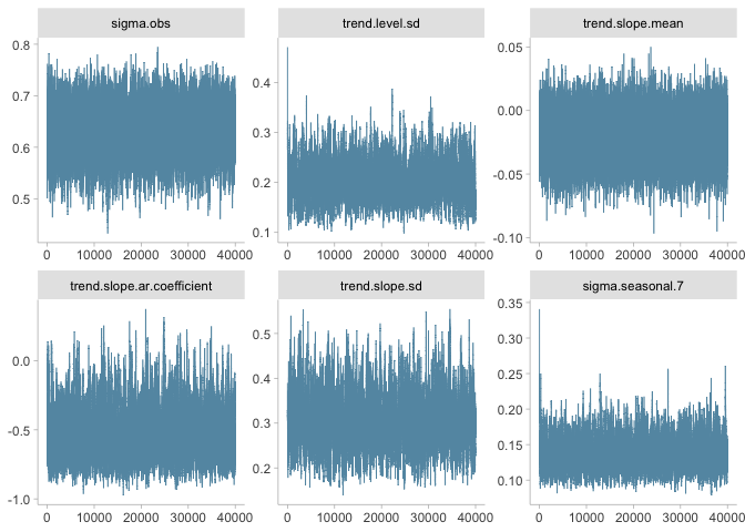
Trace plots look pretty good as well.
Predictions
Now we can predict out with our model for 180 days.
forecast_days <- 180
fits <- nc_log_diff %>%
predictions <- nc_log_diff %$%
%>%
Now we need to convert our predictions back into percentages:
pred_vax = predictions %>%
%>%
Results
Now we can visualize the outputs. We see that there is a high degree of uncertainty regarding what proportion of the population will likely be vaccinated in the coming 180 days.
widths =
pred_vax %>%
+
+
+
+
+
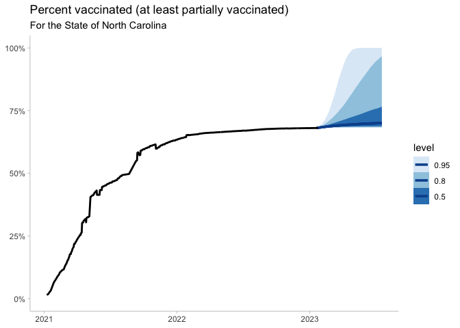
The next big question is what will be our likely vaccine coverage. If we want to target 80% of the population vaccinated, which is aggressive, but needed if of SARS-CoV-2 is close to 4-4.5 and the vaccine effectiveness is between 90-95%.
prob <- pred_vax %>%
%>%
%>%
+
+
+
+
+
prob
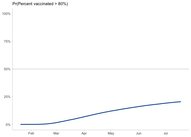
Sadly, it looks like that is a low probability outcome.
What about a county?
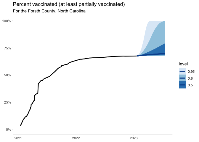
Just for fun I want to run through a single North Carolina County and see if there is any difference.
# Oddly one day showed a decrease...government records....
forsyth_log_diff <- dat %>%
. %>%
%>%
%>%
%>%
dplyr:: %>%
%>%
%>%
%>%
fit =
=-=-=-=-= Iteration 0 Sat Jan 13 16:03:50 2024 =-=-=-=-=
=-=-=-=-= Iteration 4000 Sat Jan 13 16:04:10 2024 =-=-=-=-=
=-=-=-=-= Iteration 8000 Sat Jan 13 16:04:29 2024 =-=-=-=-=
=-=-=-=-= Iteration 12000 Sat Jan 13 16:04:49 2024 =-=-=-=-=
=-=-=-=-= Iteration 16000 Sat Jan 13 16:05:09 2024 =-=-=-=-=
=-=-=-=-= Iteration 20000 Sat Jan 13 16:05:29 2024 =-=-=-=-=
=-=-=-=-= Iteration 24000 Sat Jan 13 16:05:48 2024 =-=-=-=-=
=-=-=-=-= Iteration 28000 Sat Jan 13 16:06:07 2024 =-=-=-=-=
=-=-=-=-= Iteration 32000 Sat Jan 13 16:06:26 2024 =-=-=-=-=
=-=-=-=-= Iteration 36000 Sat Jan 13 16:06:45 2024 =-=-=-=-=
fits <- forsyth_log_diff %>%
predictions <- forsyth_log_diff %$%
%>%
pred_vax = predictions %>%
%>%
pred_vax %>%
+
+
+
+
+
pred_vax %>%
%>%
%>%
+
+
+
+
+
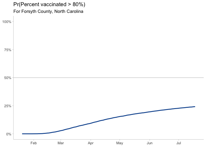
Hmm, not too much better
knitr::

Citation
BibTex citation:
@online{dewitt2021
author = {Michael E. DeWitt},
title = {Time to Vaccinate},
date = 2021-05-07,
url = {https://michaeldewittjr.com/articles/2021-05-07-time-to-vaccinate},
langid = {en}
}
For attribution, please cite this work as:
Michael E. DeWitt. 2021. "Time to Vaccinate." May 7, 2021. https://michaeldewittjr.com/articles/2021-05-07-time-to-vaccinate