Fourier and Spectral Analysis
Disease incidence is full of rhythms. Influenza peaks each winter, measles once ran in sharp biennial cycles, and many vector-borne diseases track an annual climate beat. Fourier analysis is the tool for finding and quantifying these rhythms: it decomposes a signal into a sum of sine waves and reports how much of the signal sits at each frequency. Applied to a time series, it turns a wiggly curve into a spectrum that names its dominant periods.
From waveforms to frequencies#
The foundational fact is that almost any signal can be written as a sum of sinusoids of different frequencies, amplitudes, and phases. A Fourier series does this for a periodic signal, and the Fourier transform generalizes it to any signal, mapping a function of time to a function of frequency ,
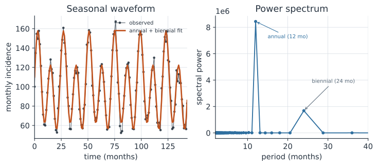
The transform is a change of coordinates: the same information, expressed in terms of “how much of each frequency” instead of “what value at each time.” The magnitude is the amplitude at frequency , and its phase says where that wave sits. Left panel of the figure shows the idea in reverse — an incidence curve rebuilt from just its two strongest sinusoids.
The discrete transform and the FFT#
Real data are sampled, not continuous, so we use the discrete Fourier transform (DFT), which turns evenly spaced observations into frequency coefficients.
Computed naively the DFT costs operations, but the fast Fourier transform (FFT) does it in , which is what makes spectral analysis routine — it is one of the most consequential algorithms in computing.
Every language has it built in (numpy.fft, R’s fft, Julia’s FFTW), so the practical work is interpreting the output, not computing it.
The periodogram#
The periodogram, or power spectrum, is the squared magnitude of the DFT coefficients plotted against frequency,
and it measures how much variance in the series is carried at each frequency. A time series with a strong annual cycle shows a sharp peak at a period of one year; the biennial measles cycle appears as a second peak at two years, exactly the two peaks in the right panel. Reading a periodogram is how you detect and quantify periodicity that is hard to see by eye, distinguish a genuine cycle from noise, and compare the dominant timescales of different diseases or places. The spectrum is also the frequency-domain twin of the autocovariance function: the two are Fourier transforms of each other.
When the rhythm changes: wavelets#
A periodogram assumes the rhythm is fixed over the whole record, but epidemic cycles drift — measles shifted from annual to biennial as birth rates and vaccination changed. Wavelet analysis relaxes the assumption, estimating a spectrum that varies over time so you can see when a periodicity strengthens, weakens, or changes period. It was central to showing how measles epidemics form travelling waves whose phase and dominant period shift across space and time (Grenfell et al. 2001), and wavelet coherence extends it to ask whether two series — cases and climate, or two regions — oscillate together.
A worked example#
We build a monthly incidence series with an annual and a biennial component, take its FFT, and read the dominant periods off the periodogram.
In code#
R#
set.seed(1834)
t <- 0:143
inc <- 100 + 40 * sin(2 * pi * t / 12) +
       18 * sin(2 * pi * t / 24 + 0.7) + rnorm(144, 0, 6)

x <- inc - mean(inc)
power <- Mod(fft(x))^2
freq <- (0:143) / 144                       # cycles per month
half <- 2:73                                # positive frequencies
period <- 1 / freq[half]
dominant <- period[which.max(power[half])]

round(c(dominant_period = dominant), 2)
Python#
import numpy as np

rng = np.random.default_rng(1834)
t = np.arange(144)
inc = (100 + 40 * np.sin(2 * np.pi * t / 12)
       + 18 * np.sin(2 * np.pi * t / 24 + 0.7) + rng.normal(0, 6, 144))

x = inc - inc.mean()
power = np.abs(np.fft.rfft(x)) ** 2
freq = np.fft.rfftfreq(144, d=1.0)          # cycles per month
period = 1 / freq[1:]                        # drop the zero frequency
power = power[1:]

order = np.argsort(power)[::-1]
print(f"dominant period  = {period[order[0]]:.1f} months")
print(f"next period      = {period[order[1]]:.1f} months")
dominant period  = 12.0 months
next period      = 24.0 months
Julia#
using FFTW, Random, Statistics

Random.seed!(1834)
t = 0:143
inc = 100 .+ 40 .* sin.(2π .* t ./ 12) .+
      18 .* sin.(2π .* t ./ 24 .+ 0.7) .+ randn(144) .* 6

x = inc .- mean(inc)
power = abs.(rfft(x)) .^ 2
freq = rfftfreq(144, 1.0)                    # cycles per month
period = 1 ./ freq[2:end]
power = power[2:end]

dominant = period[argmax(power)]
(dominant_period = dominant,)
The two largest peaks land at 12 and 24 months, recovering the annual and biennial components that built the series.
Why it matters#
Spectral analysis turns the question “is there a cycle, and how long is it?” from an eyeball judgment into a measurement, which is why it underlies work on disease seasonality, multiannual epidemic cycles, and the climate signals that drive them. The Fourier transform’s deeper role is as a change of view: many problems that are tangled in the time domain — filtering noise, describing a Gaussian process kernel, detecting a periodicity — become simple in the frequency domain. When the rhythm itself moves, wavelets carry the same idea into a world where the spectrum is allowed to change.
Related#
- Wavelet Analysis — time-localized spectra for periodicities that change over time
- Covariance Functions and the Matérn Family — the spectrum as the transform of the autocovariance
- Climate Forcing in Transmission Models — the seasonal drivers spectra reveal
- Critical Community Size and Epidemic Fade-Out — the biennial measles dynamics
- Spatial Synchrony — phase and coherence across populations
- Random Walks and Brownian Motion — the spectrum of a noise process