Wavelet Analysis
A Fourier spectrum tells you which periodicities a signal contains, but not when they were present. That is fine for a stationary signal, but epidemic time series are rarely stationary: measles shifted from annual to biennial cycles as vaccination changed susceptible supply, cholera’s periodicity tracks a wandering climate signal, and dengue and influenza wax and wane in strength year to year. Wavelet analysis solves this by decomposing a signal in time and frequency at once — it answers “what periods are present, and how does that change through the series,” which is exactly the question non-stationary disease dynamics pose.
From Fourier to wavelets#
The Fourier transform correlates a signal against infinitely long sines and cosines, so a burst of periodicity that lasts only a few years gets smeared across the whole spectrum with no indication of when it occurred. A wavelet is instead a localized, wave-like bump — a “mother wavelet” that is stretched or squeezed to probe different periods and slid along the series to probe different times. The continuous wavelet transform (CWT) correlates the signal with a scaled () and shifted () copy of the wavelet,
giving a coefficient for every scale–time pair. Small scales squeeze the wavelet to catch short periods (high frequency); large scales stretch it for long periods. The standard choice for time series is the Morlet wavelet — a complex sinusoid inside a Gaussian envelope, — because it balances time and frequency resolution well and, being complex, returns both amplitude and phase. For the Morlet wavelet with , scale and Fourier period are almost equal, , so you can read the vertical axis directly in period units.
The scalogram and its caveats#
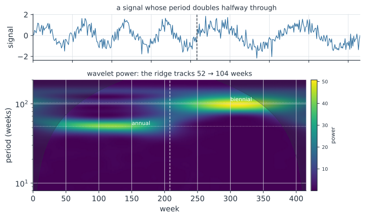
The squared magnitude is the wavelet power spectrum, or scalogram — a heatmap of power over time (horizontal) and period (vertical), like the figure above. A persistent cycle shows up as a horizontal ridge; a periodicity that strengthens, fades, or shifts shows up as a ridge that brightens, dims, or moves — the annual-to-biennial jump is the ridge stepping from the 52- to the 104-week band. Two caveats always travel with a scalogram:
- The cone of influence (COI). Near the start and end of the series the wavelet runs off the edge of the data, so power there is unreliable — especially at long periods, where the wavelet is widest. The COI (shaded in the figure) marks that edge-contaminated region; ignore ridges inside it.
- Significance. Power must be judged against a null of no periodicity, usually a red-noise (AR(1)) background; software overlays contours where power exceeds, say, the 95% level so you do not over-read noise.
There is an unavoidable resolution trade-off (the uncertainty principle): short periods are pinned down sharply in time but coarsely in frequency, and long periods vice versa, which is why the biennial band in the figure is broader than the annual one.
Wavelet coherence: two signals#
The real payoff for disease ecology is comparing two series. Wavelet coherence measures, at each period and time, how strongly two signals co-vary — a localized, scale-resolved correlation — and the phase of the complex cross-wavelet tells you their lead–lag relationship at that period. This is how one asks whether cholera cycles are coherent with El Niño and by what lag, whether neighboring cities’ measles epidemics are synchronized, or whether dengue tracks temperature — all questions where the relationship holds only in certain bands and certain years, which a single correlation or Fourier cross-spectrum would miss. It connects directly to climate forcing of transmission and to spatial synchrony and the Moran effect.
A worked example#
We build a weekly signal whose dominant cycle doubles from 52 to 104 weeks halfway through — a caricature of the measles transition — and recover the change with a from-scratch Morlet CWT, reading off the dominant period in an early and a late window.
In code#
The R version uses the WaveletComp package (biwavelet is the other common choice), which also draws significance contours, the cone of influence, and wavelet coherence.
The Python and Julia versions build the Morlet transform directly.
R#
library(WaveletComp)
df <- data.frame(t = seq_along(x), x = x)
wt <- analyze.wavelet(df, "x", dt = 1, dj = 1/20,
                      lowerPeriod = 8, upperPeriod = 200)
wt.image(wt, periodlab = "period (weeks)")     # scalogram + COI + 95% contours

# wavelet coherence between two series (e.g. cases and a climate driver):
# wc <- analyze.coherency(df2, my.pair = c("cases", "rainfall"))
# wc.image(wc)                                  # coherence, with phase arrows
Python#
import numpy as np

rng = np.random.default_rng(0)
n, dt = 416, 1.0                                    # weekly series, ~8 years
t = np.arange(n)
sig = np.where(t < 208, np.sin(2 * np.pi * t / 52),  # annual, first half
               np.sin(2 * np.pi * t / 104))          # biennial, second half
x = sig + rng.normal(0, 0.4, n)


def cwt_morlet(x, dt, periods, w0=6.0):
    """Continuous wavelet transform via FFT; returns power over (period, time)."""
    xh = np.fft.fft(x - x.mean())
    omega = 2 * np.pi * np.fft.fftfreq(len(x), d=dt)
    scales = periods * (w0 + np.sqrt(2 + w0 ** 2)) / (4 * np.pi)   # period -> scale
    W = np.empty((len(scales), len(x)), complex)
    for i, s in enumerate(scales):
        norm = np.sqrt(2 * np.pi * s / dt) * np.pi ** -0.25
        daughter = norm * np.exp(-0.5 * (s * omega - w0) ** 2) * (omega > 0)
        W[i] = np.fft.ifft(xh * daughter)           # Morlet daughter, freq domain
    return np.abs(W) ** 2


periods = np.geomspace(8, 200, 80)
power = cwt_morlet(x, dt, periods)

# dominant period in an early vs late window (away from the edges / COI)
early = periods[power[:, 40:150].mean(1).argmax()]
late = periods[power[:, 260:370].mean(1).argmax()]
print(f"early-window dominant period = {early:.0f} weeks (truth 52)")
print(f"late-window  dominant period = {late:.0f} weeks (truth 104)")
early-window dominant period = 52 weeks (truth 52)
late-window  dominant period = 100 weeks (truth 104)
Julia#
using ContinuousWavelets, Wavelets

# Morlet continuous wavelet transform of the signal x
c = wavelet(Morlet(6.0), β = 2)
W = ContinuousWavelets.cwt(x, c)     # coefficients over time x scale
power = abs2.(W)                     # |W|^2 scalogram
When to use which#
Reach for a plain Fourier / spectral analysis when the signal is stationary — a fixed set of cycles present throughout — because it is simpler and its peaks are sharper. Reach for wavelets when the periodicity changes over time: strengthening, fading, or shifting cycles, transient bursts, or a relationship between two series that holds only in some epochs. Most infectious-disease time series are in the second camp, which is why wavelets became a standard tool in disease ecology after Grenfell, Bjørnstad & Kappey (2001) used them to map the traveling waves and shifting cycles of measles.
Why it matters#
Wavelet analysis is the natural lens for the non-stationary rhythms that fill infectious-disease data: the shift of measles from annual to biennial cycles, the waxing and waning coherence between cholera and ENSO, the year-to-year change in influenza and dengue seasonality, and the spatial synchrony of neighboring populations. By resolving when each periodicity is present and how two signals lead or lag across scales, it exposes mechanism — susceptible-supply changes, climate forcing, dispersal-driven synchrony — that a single whole-series Fourier spectrum blurs away. When a cycle in your data is not fixed but moving, the scalogram is how you see it move.
Related#
- Fourier and Spectral Analysis — the stationary counterpart; wavelets localize its spectrum in time
- Climate Forcing in Transmission Models — the seasonal and interannual drivers wavelet coherence detects
- Spatial Synchrony and the Moran Effect — synchrony across populations, a prime target of wavelet coherence
- Covariance Functions and the Matérn Family — the correlation view of dependence in a signal
- Random Walks and Brownian Motion — the red-noise background significance is tested against
- The Effective Reproduction Number and Forecasting — the periodicities wavelets track feed transmission dynamics
- Quantitative Methods