Dimensionality Reduction and Embeddings
Modern biological data is wide: a single-cell experiment measures thousands of genes per cell, a serology panel dozens of antigens, a pathogen genome tens of thousands of sites. You cannot plot a thousand dimensions, and models struggle in them, so a recurring first move is dimensionality reduction — finding a handful of coordinates that keep what matters and discard the rest. This is unsupervised learning: no labels, just the search for structure. The linear workhorse is principal component analysis; when the structure is a curved manifold, nonlinear methods like t-SNE and UMAP untangle it, and both are steps toward the broader idea of an embedding — a learned low-dimensional representation that captures the meaning of the data.
Why reduce dimensions#
High dimensions hurt in several ways — collectively the curse of dimensionality. Data become sparse, distances between points concentrate and lose meaning, and models need exponentially more data to fill the space, so they overfit. Reduction buys four things: visualization (project to 2–3 dimensions you can actually look at), denoising (the discarded directions are often mostly noise), features (fewer, decorrelated inputs for a downstream model), and compression. The catch is that squeezing many dimensions into few must lose information; the art is losing the unimportant information, and different methods disagree about what that is.
Principal component analysis#
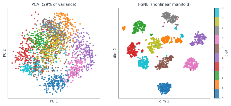
Principal component analysis (PCA) is the linear answer: find the orthogonal directions along which the data vary most, and keep the first few. The principal components are the eigenvectors of the data’s covariance matrix, and each eigenvalue is the variance captured along its direction, so ranking components by eigenvalue orders them by how much of the spread they explain. Projecting onto the top components gives the best -dimensional linear approximation of the data in a least-squares sense — equivalently the truncated singular value decomposition of the centered data matrix. The explained-variance ratio tells you how much you kept: in the figure, two components capture only 29% of the digit data’s variance, which is why the classes smear together — the structure that separates digits is not linear. PCA is fast, deterministic, and interpretable (each component is a weighted combination of the original features), and it is exactly a linear autoencoder — the linear special case of the representation learning a VAE does nonlinearly.
Nonlinear manifold learning#
Often the data lie on a curved, low-dimensional manifold embedded in the high-dimensional space — think of a sheet rolled up in 3D — and a linear projection cannot flatten it. Manifold-learning methods reduce dimensions while respecting that curved geometry. t-SNE (t-distributed stochastic neighbor embedding) places points in 2D so that each point’s near neighbors in the original space stay near in the map, which is superb at revealing clusters — the separated digit blobs on the right of the figure — but it deliberately preserves only local structure. UMAP (uniform manifold approximation and projection) does something similar from a topological foundation, and is faster, scales better, and preserves more global structure, which has made it the default for single-cell and genomic visualization.
Read t-SNE and UMAP plots with care. The distances between clusters, the sizes of clusters, and the density of points are not meaningful — only which points are neighbors is. Both are stochastic (results depend on the random seed) and have knobs (t-SNE’s perplexity, UMAP’s n_neighbors) that change the picture, so treat these maps as hypothesis-generating visualizations, not as quantitative summaries, and never feed t-SNE coordinates into a distance-based downstream analysis.
Embeddings#
PCA and UMAP produce embeddings — vectors in a low-dimensional space where geometry encodes similarity — and the idea generalizes far beyond visualization. A neural network can learn an embedding tuned for a task: an autoencoder or VAE compresses data through a bottleneck, a transformer produces contextual embeddings of tokens (a genome, a clinical note), and a graph neural network embeds nodes of a contact network. The unifying principle is that a good embedding puts semantically similar things close together, so that a hard problem in the raw high-dimensional space becomes easy in the learned representation — the reason “learn a representation first” is such a common opening move.
A worked example#
Take three genes measured on a set of cells, and suppose two of them are nearly redundant — they rise and fall together — while the third varies independently. PCA discovers this automatically: the first principal component points along the shared axis of the two correlated genes and captures most of the variance, the second picks up the independent gene, and the third captures almost nothing and can be dropped. Two coordinates now stand in for three with little loss, and if hundreds of genes move in a few coordinated programs, PCA collapses hundreds of dimensions to a handful — the everyday reality of transcriptomic data.
In code#
Python#
PCA reports how much variance each component keeps, and a quick nearest-neighbor score shows how much better a nonlinear embedding separates classes in 2D:
import numpy as np
from sklearn.datasets import load_digits
from sklearn.decomposition import PCA
from sklearn.manifold import TSNE
from sklearn.neighbors import KNeighborsClassifier
from sklearn.model_selection import cross_val_score

X, y = load_digits(return_X_y=True)                 # 1797 points in 64 dimensions
pca = PCA(n_components=2, svd_solver="full").fit(X)
print(f"PCA: 2 components keep {100*pca.explained_variance_ratio_.sum():.0f}% of variance")

emb_pca = pca.transform(X)
emb_tsne = TSNE(n_components=2, init="pca", perplexity=30,
                random_state=0).fit_transform(X)
for name, emb in [("PCA", emb_pca), ("t-SNE", emb_tsne)]:
    acc = cross_val_score(KNeighborsClassifier(10), emb, y, cv=3).mean()
    print(f"{name:6s} 2D embedding: 10-NN accuracy {acc:.2f}")
PCA: 2 components keep 29% of variance
PCA    2D embedding: 10-NN accuracy 0.62
t-SNE  2D embedding: 10-NN accuracy 0.98
UMAP is the standard for single-cell and genomic data; its API mirrors scikit-learn, and it separates the digit classes about as well as t-SNE:
import umap
emb_umap = umap.UMAP(n_neighbors=15, min_dist=0.1,
                     random_state=0).fit_transform(X)   # cells x genes -> cells x 2
acc = cross_val_score(KNeighborsClassifier(10), emb_umap, y, cv=3).mean()
print(f"UMAP 2D embedding: 10-NN accuracy {acc:.2f}")
UMAP 2D embedding: 10-NN accuracy 0.98
R#
# prcomp for PCA; Rtsne and uwot for t-SNE / UMAP.
pca <- prcomp(X, center = TRUE, scale. = TRUE)
summary(pca)$importance[2, 1:5]        # proportion of variance per component
library(uwot)
emb <- umap(X, n_neighbors = 15, min_dist = 0.1)
Julia#
# MultivariateStats for PCA; TSne.jl / UMAP.jl for the nonlinear maps.
using MultivariateStats, UMAP
M = fit(PCA, X'; maxoutdim = 2)        # columns are observations
emb = umap(X', 2; n_neighbors = 15)
Why it matters#
Dimensionality reduction is the quiet first step behind a great deal of modern biology and epidemiology. Population-genetics PCA reveals ancestry structure and is used to control for it in genome-wide association studies; UMAP of single-cell RNA-seq is how cell types are discovered and displayed; embeddings of pathogen genomes cluster lineages and track emerging variants; and low-dimensional representations of serology or cytometry panels turn dozens of noisy markers into interpretable axes. Two disciplines keep it honest: remember that PCA’s components are linear combinations to be interpreted cautiously, and that t-SNE/UMAP maps show neighborhoods, not distances — a beautiful embedding is a lens for generating hypotheses, which then need testing by methods that quantify rather than merely display.